DHC SKINCARE
90-Day Brand Transformation for US Market
Role: Digital Creative Director

CHALLENGE
DHC Skincare, an established Japanese beauty brand with 40+ years of heritage, needed to compete in the US market with a localized brand presence that would resonate with American consumers while maintaining its authentic Japanese identity.
The assignment: Complete brand repositioning, visual identity refresh, and full digital/print ecosystem within 90 days to meet launch deadline.

MY APPROACH
Strategic Foundation (Week 1-2)
Conducted brand and competitive audits to understand DHC's market position and identify differentiation opportunities. Researched US premium skincare landscape and consumer expectations to inform positioning strategy.
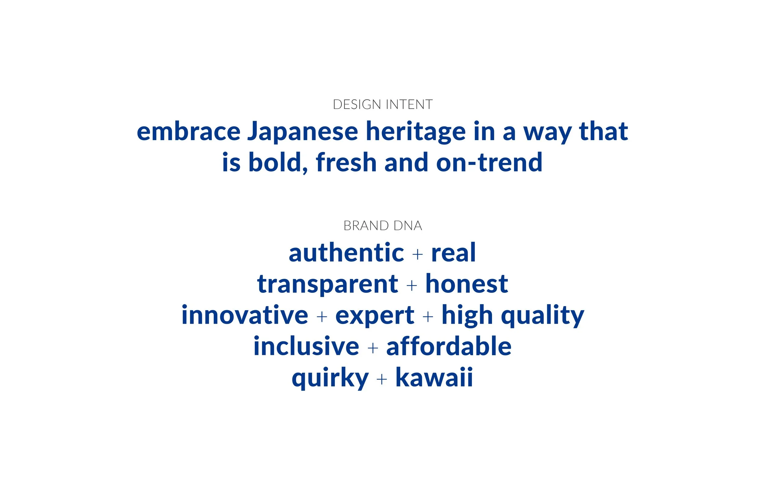
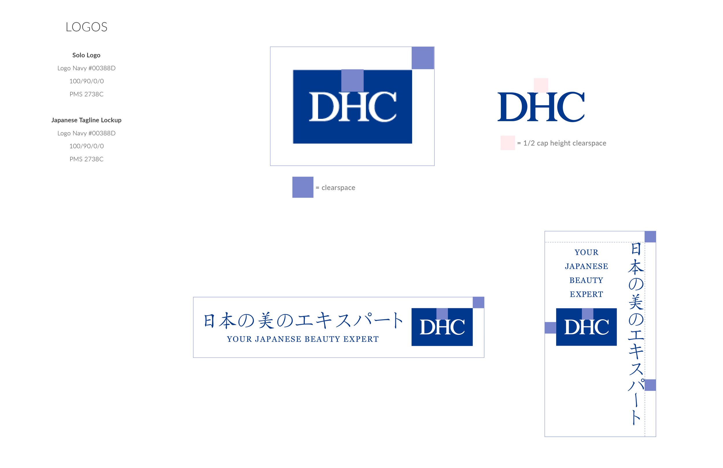
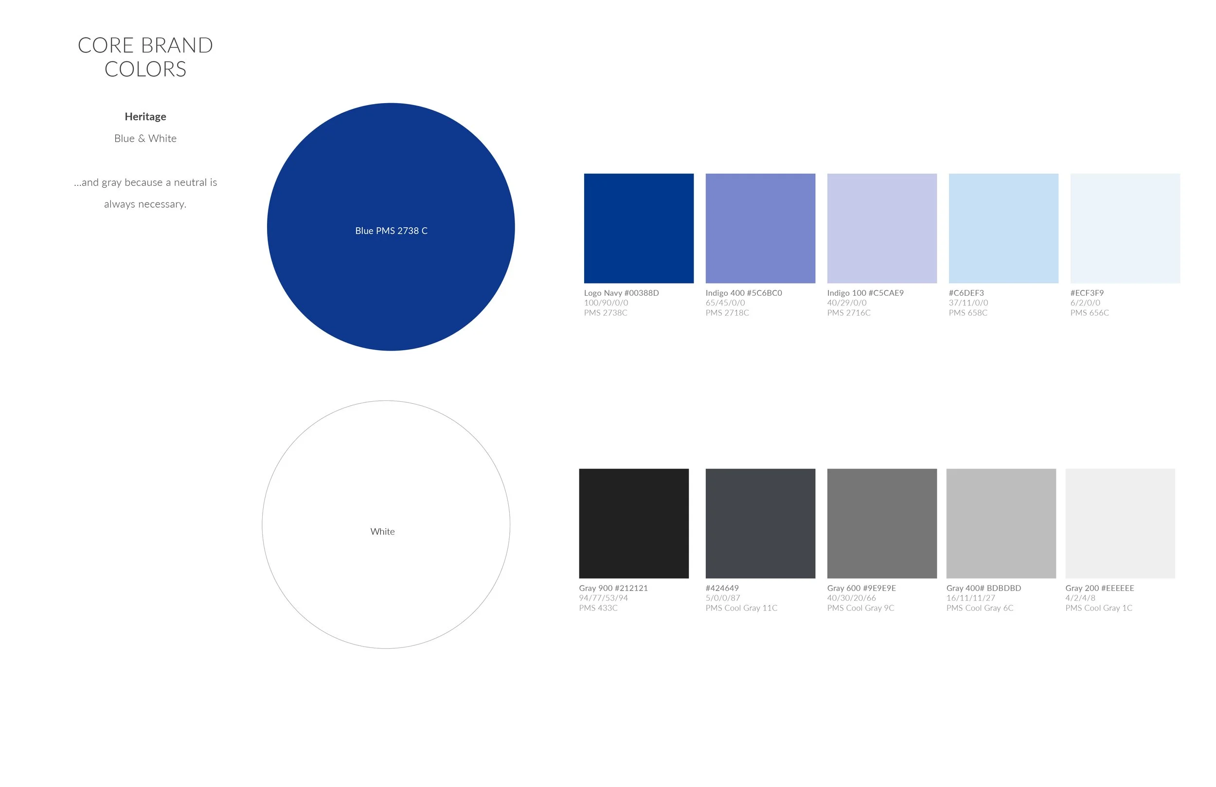
Visual Identity Development (Week 3-4)
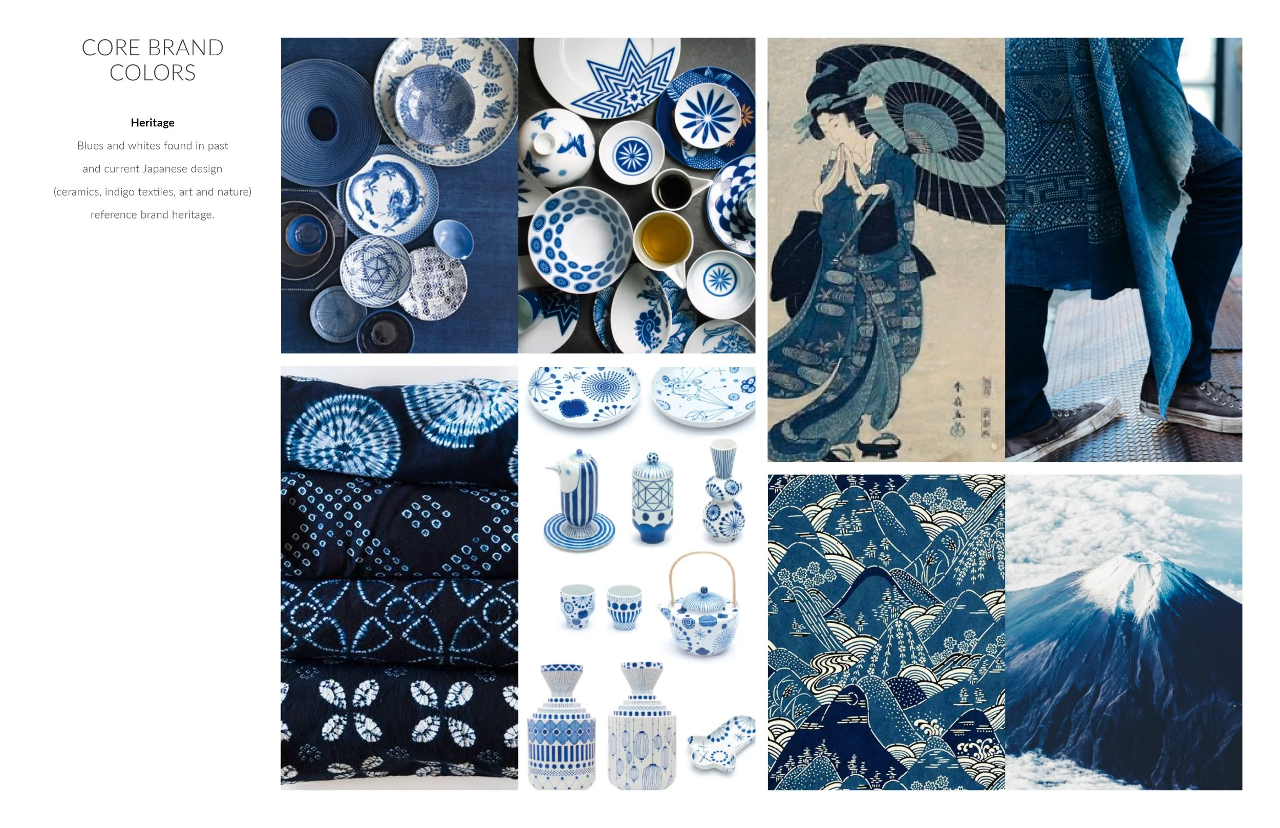
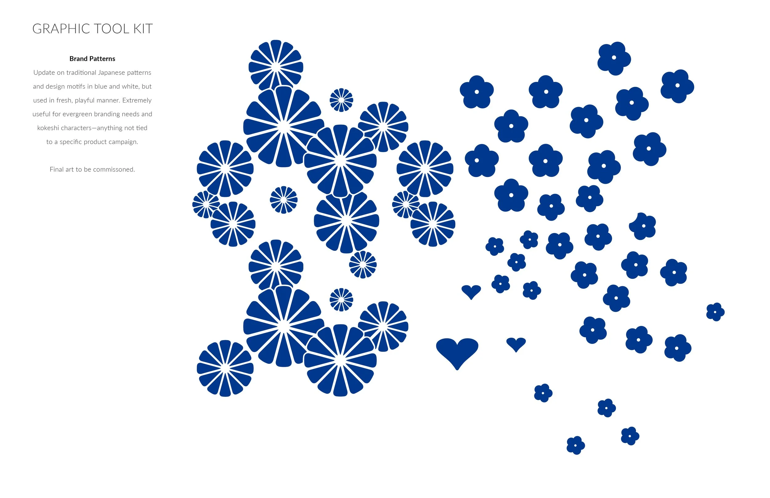
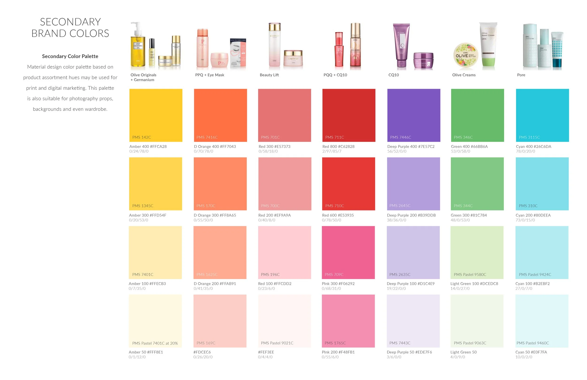
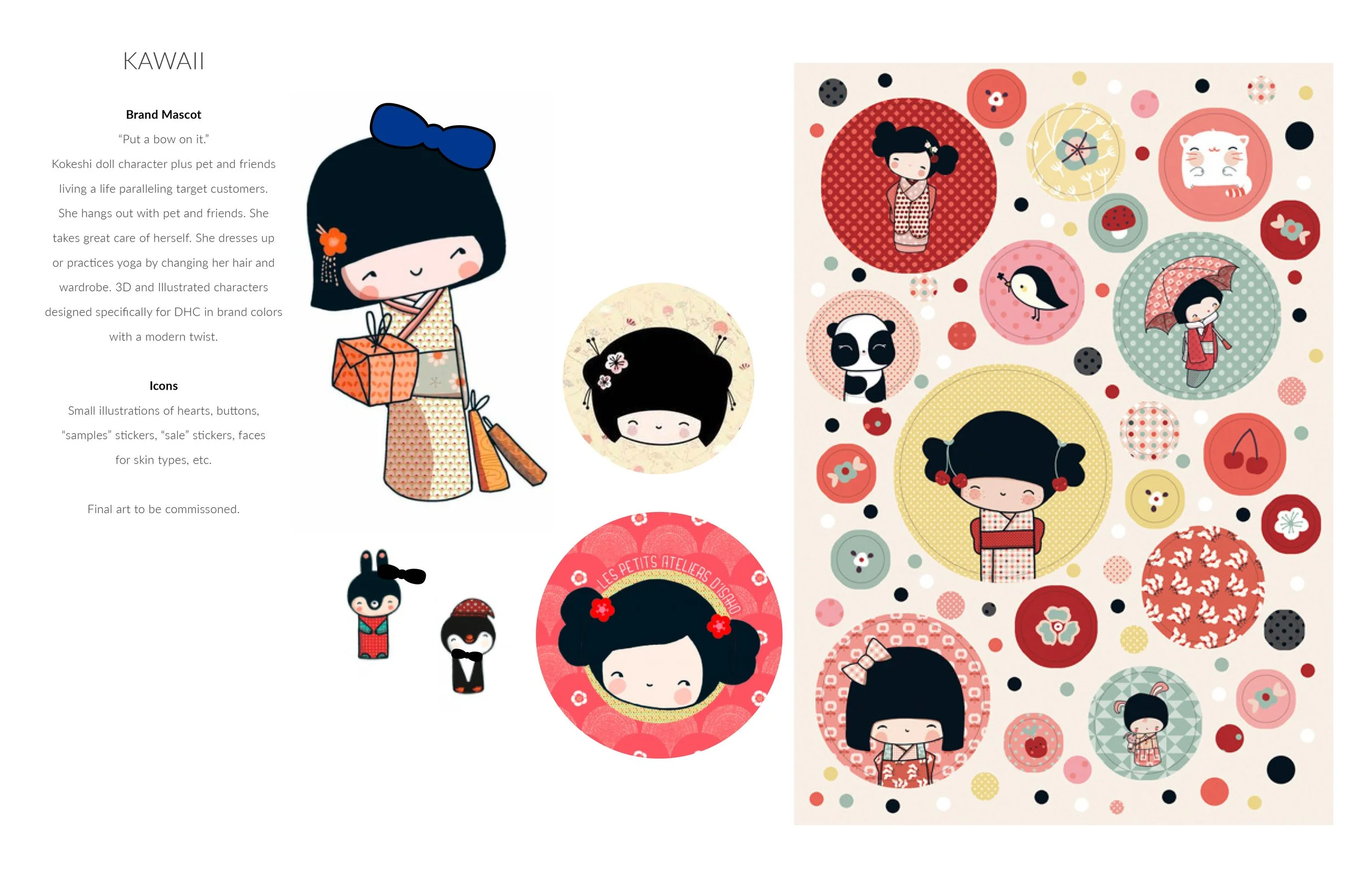
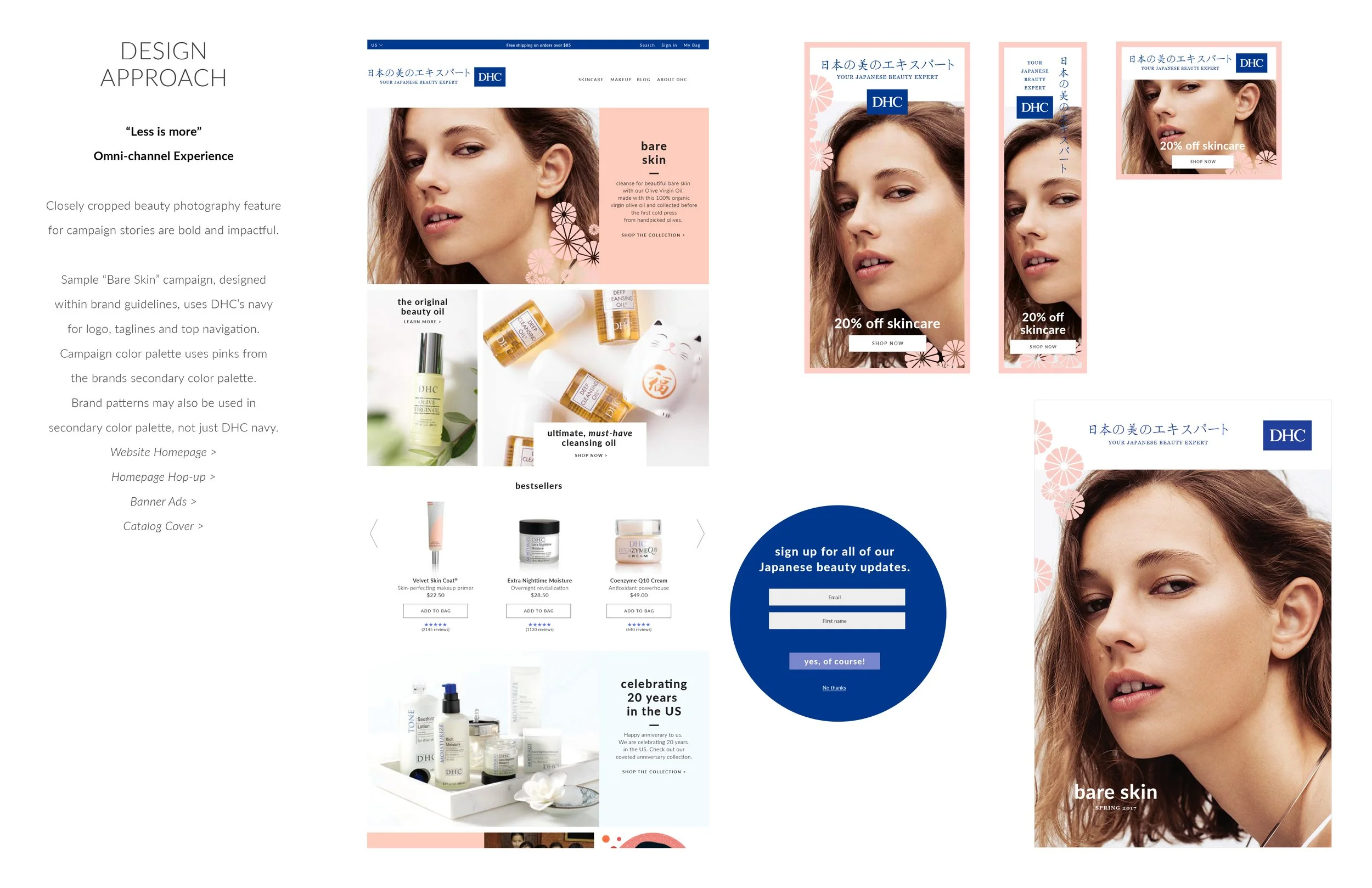
Developed visual language rooted in wabi-sabi, the Japanese aesthetic of imperfection and impermanence. Created design system using clean lines, thoughtful negative space, and refined color palette that evoked authentic heritage without cultural clichés.
360° Creative Execution (Week 5-10)
Led end-to-end creative production across all touchpoints:
Website redesign and development
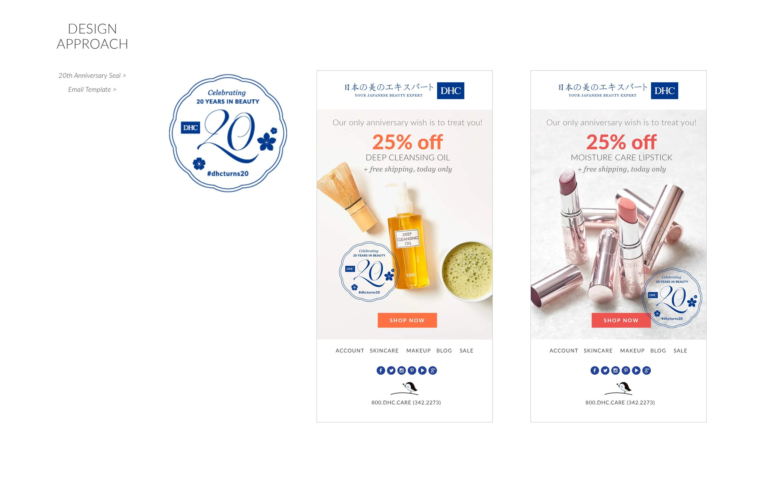
Email template system
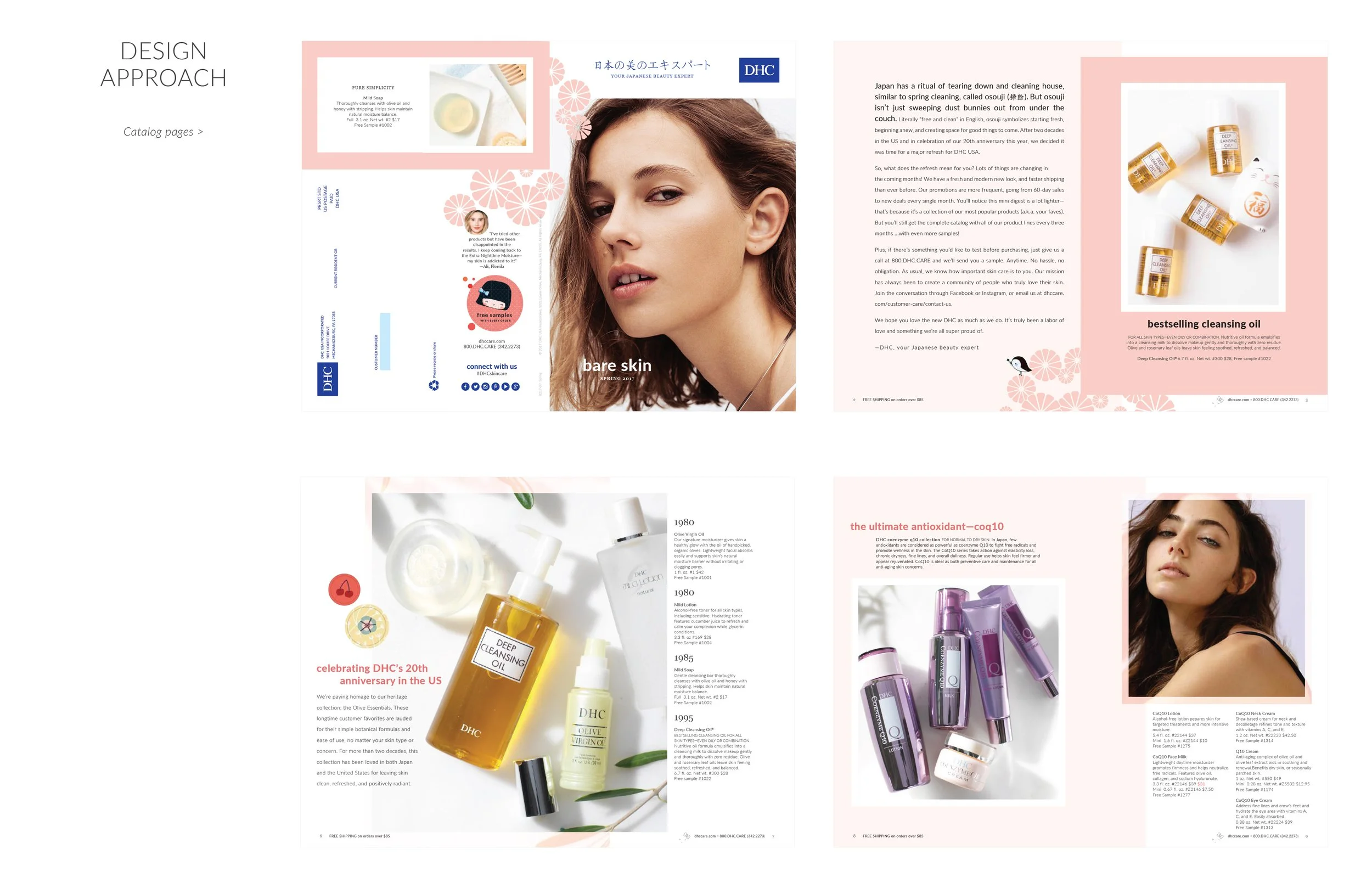
Print catalog design and production
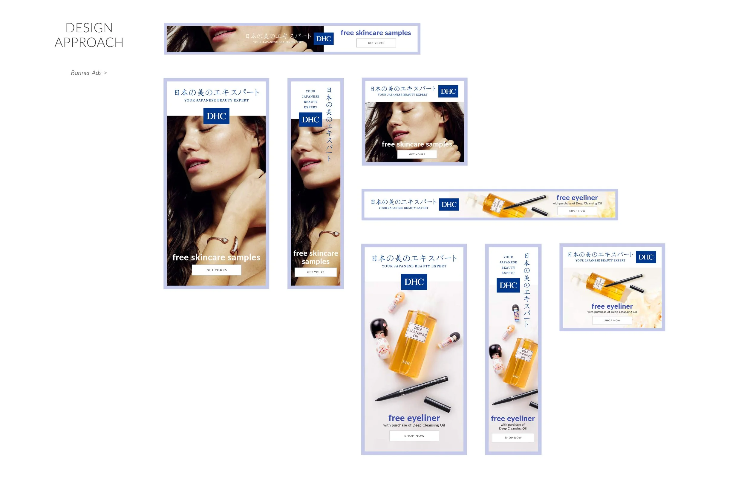
Banner ads and digital marketing assets
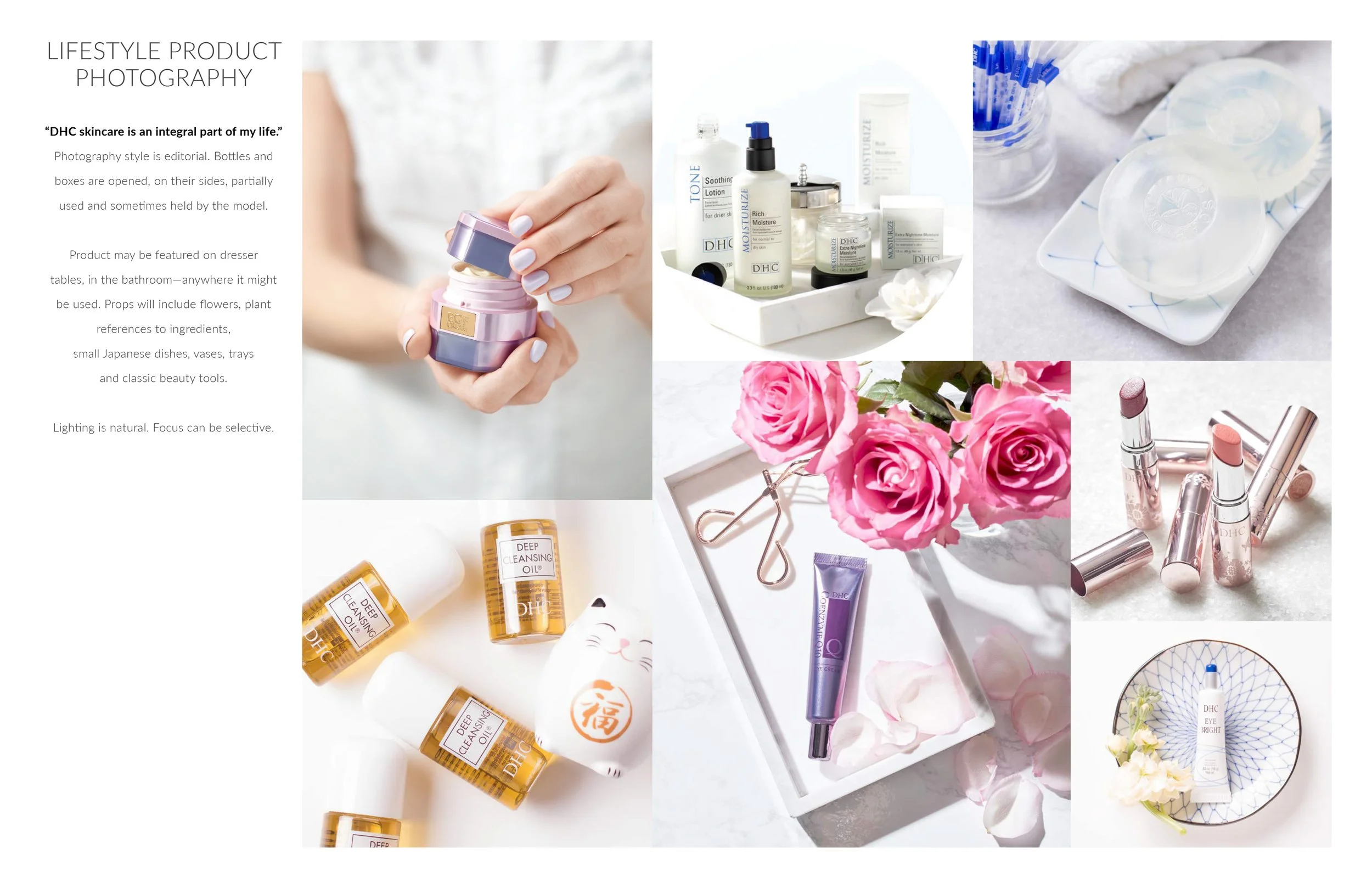
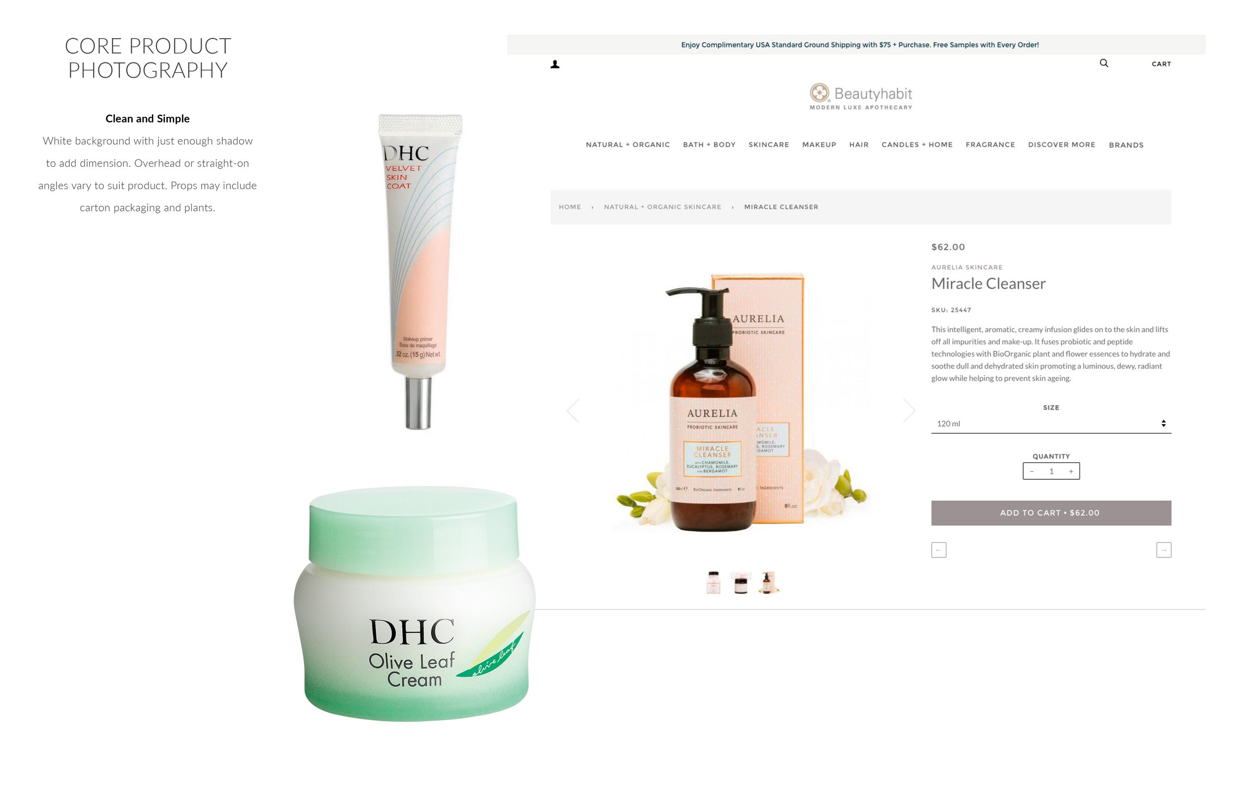
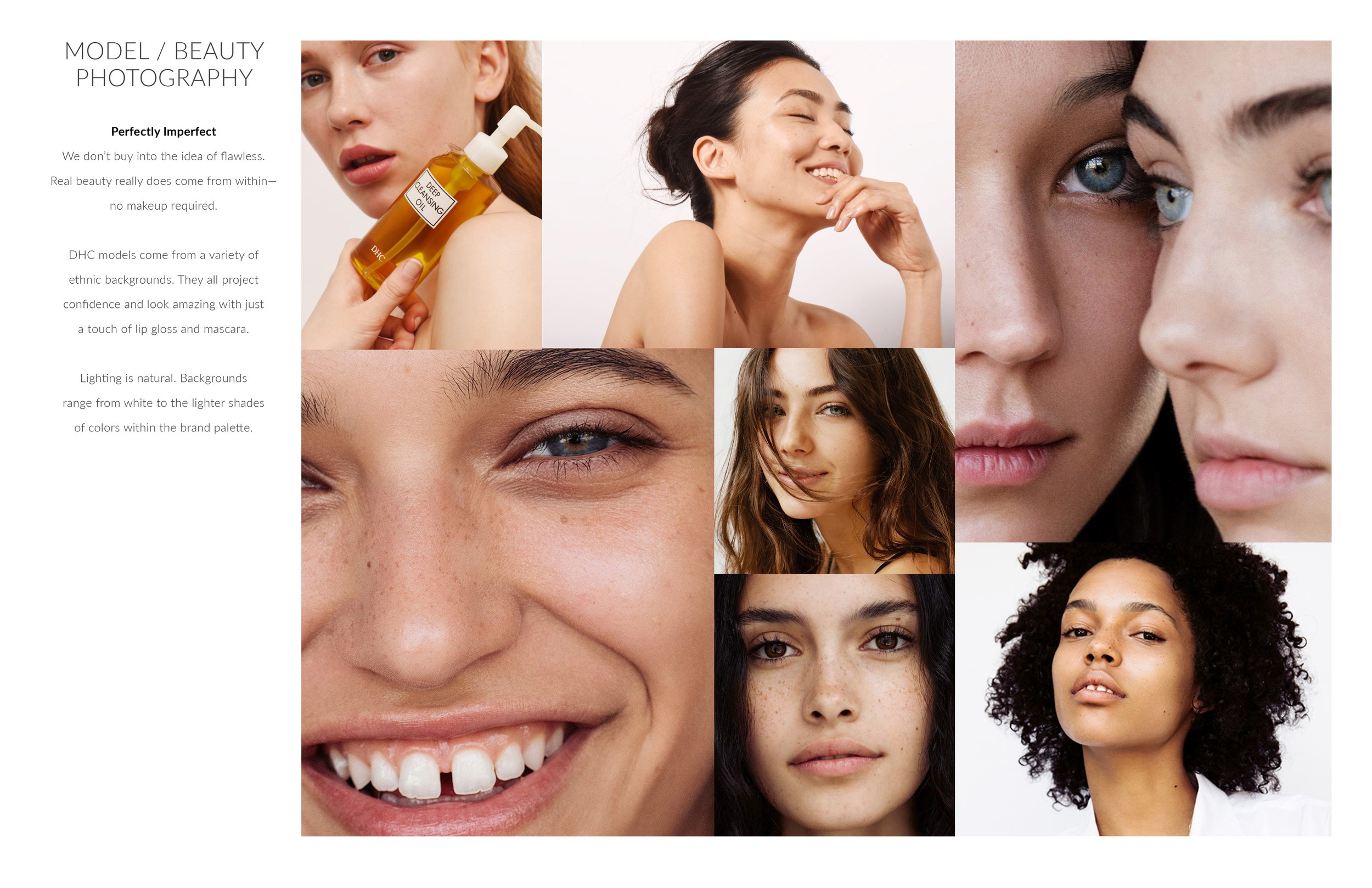
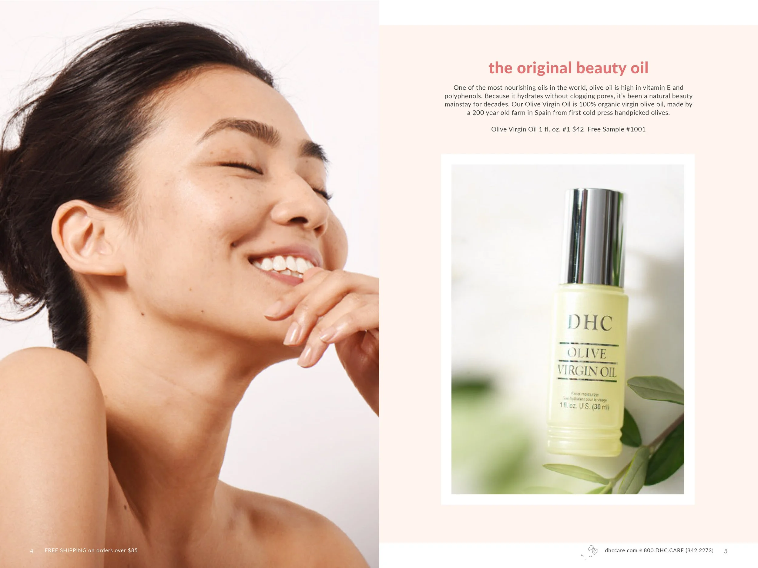
Photography art direction (product and lifestyle)
Typography system and brand guidelines
Cross-Functional Coordination
Managed stakeholder alignment between US marketing team, Japanese brand guardians, eCommerce developers, and external vendors. Established streamlined approval process that kept 90-day timeline on track despite multiple review layers.
Brand Elevation Detail
Commissioned renowned Parisian illustrator for special gift-with-purchase sticker series, adding exclusive artistic element that elevated brand's premium positioning and cultural authenticity.
THE RESULT
Complete US market transformation delivered in 90 days
Established cohesive brand presence
across digital and print that felt distinctly Japanese yet accessible to American consumers
Created scalable creative systems
(brand guidelines, templates, photography standards) that enabled ongoing US market campaigns
Successful US market entry
with modern premium positioning that competed effectively against established brands
Built foundation for eCommerce growth
through optimized site experience and marketing infrastructure

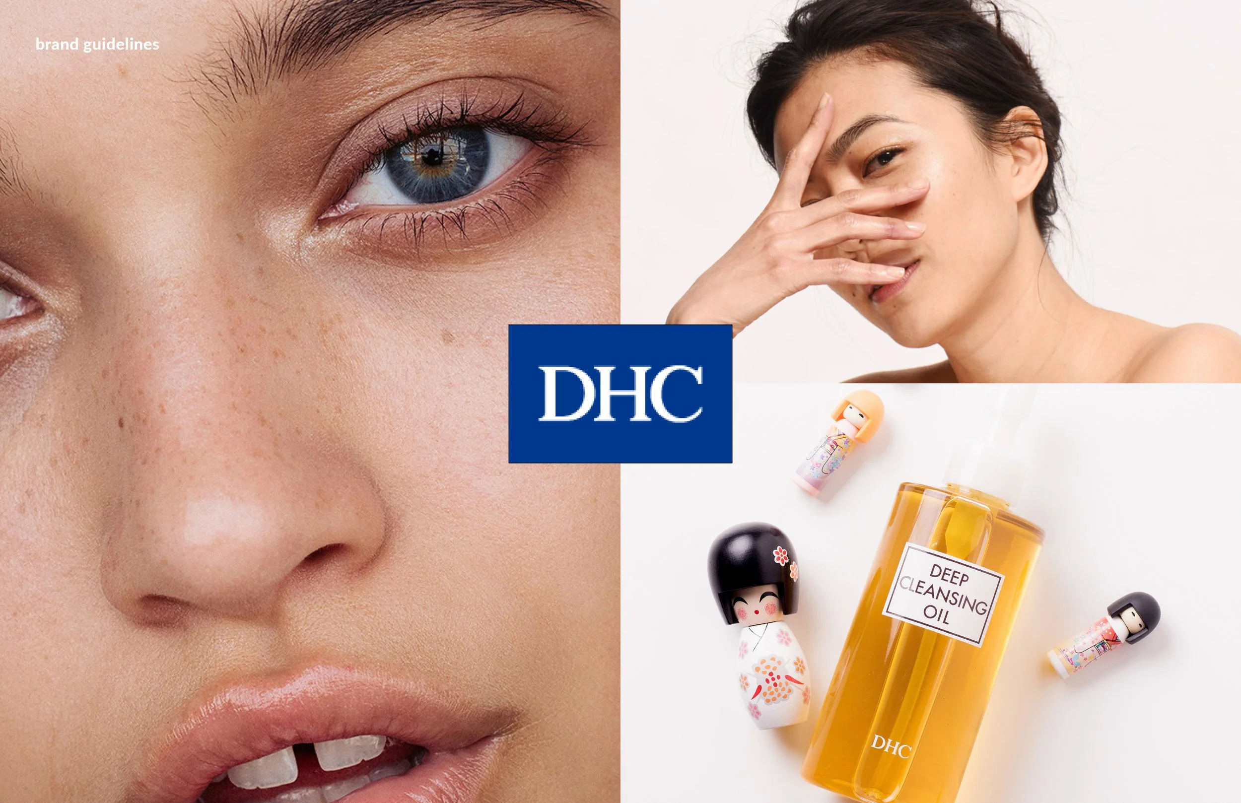
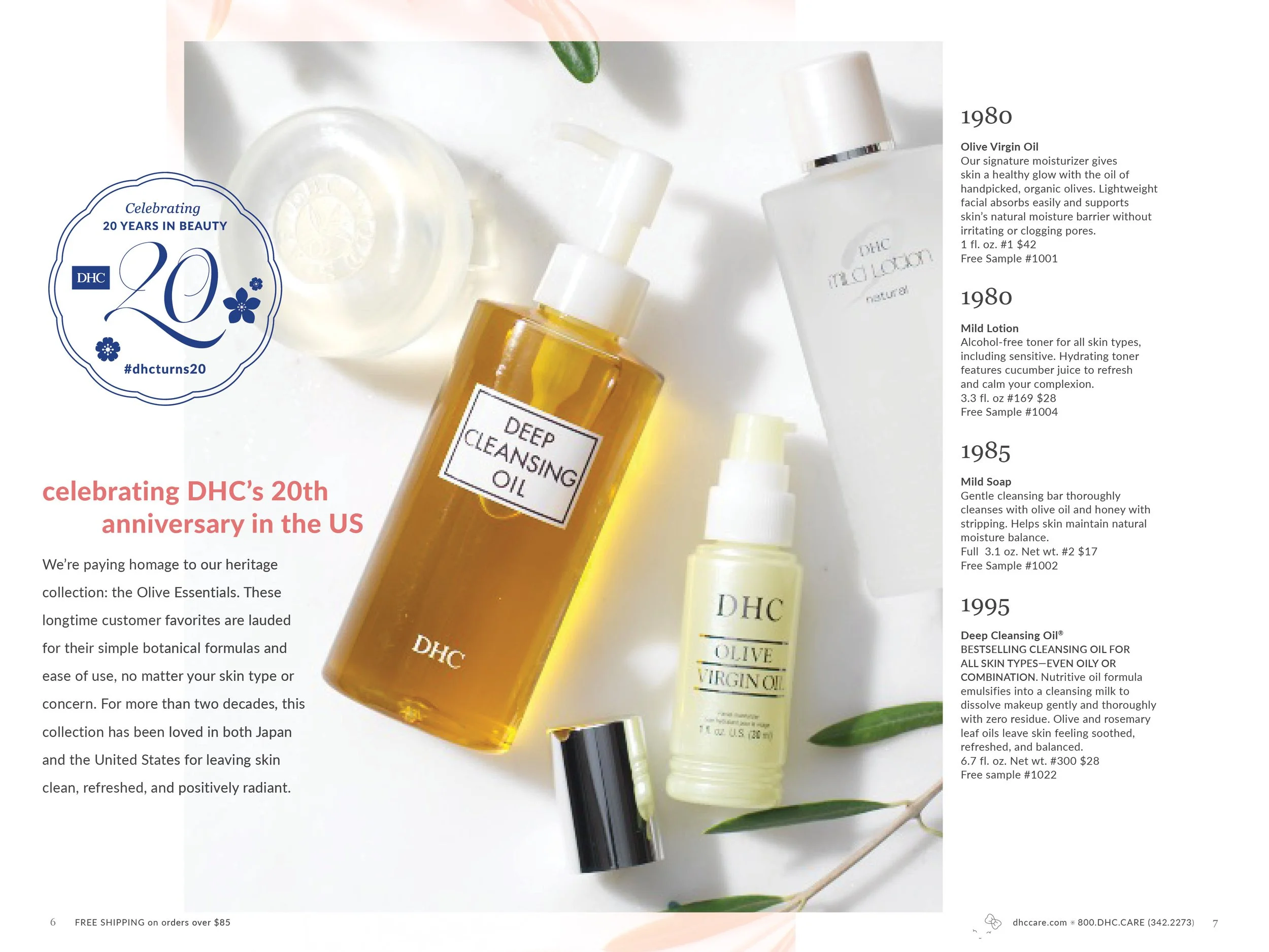
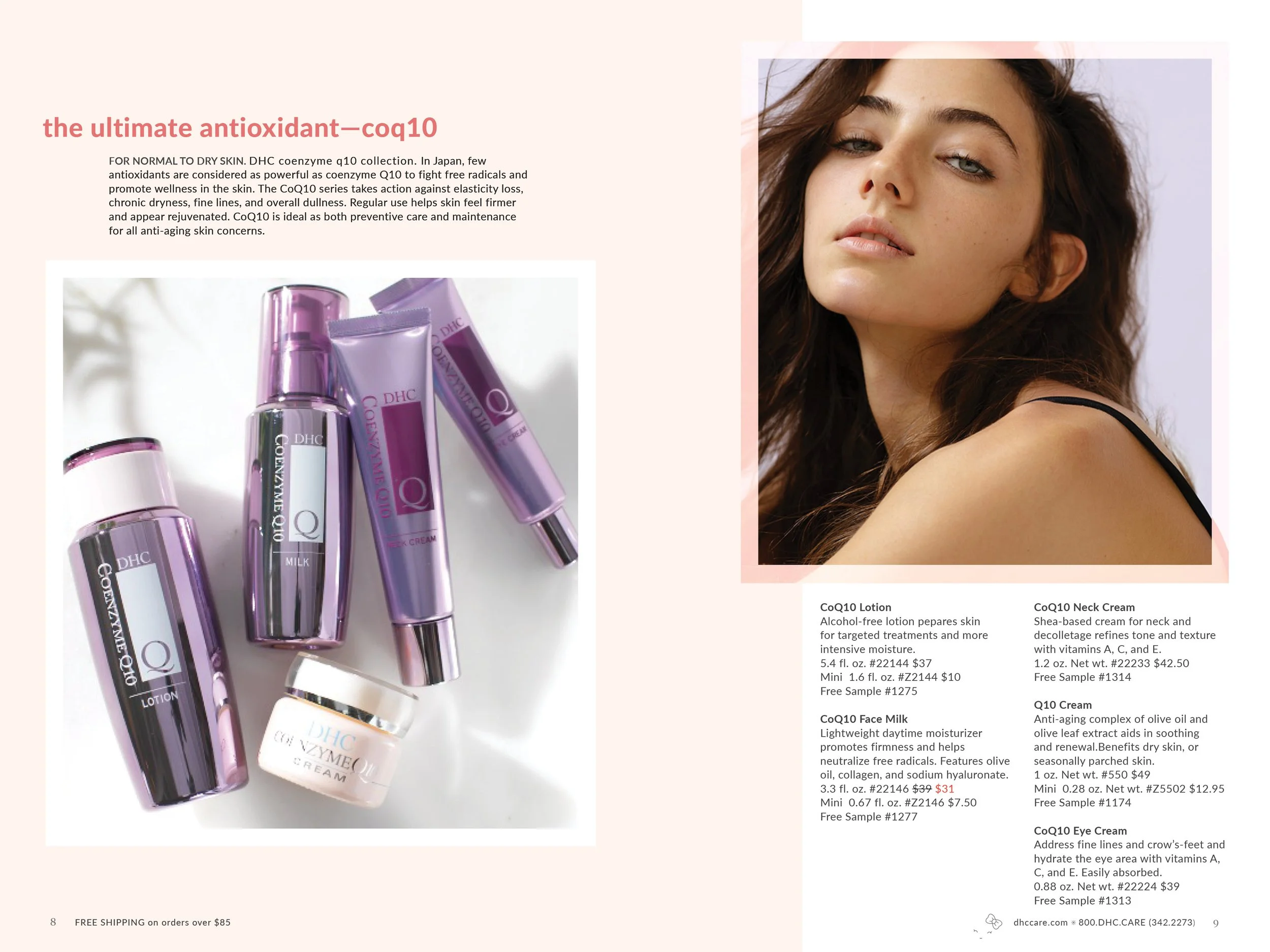
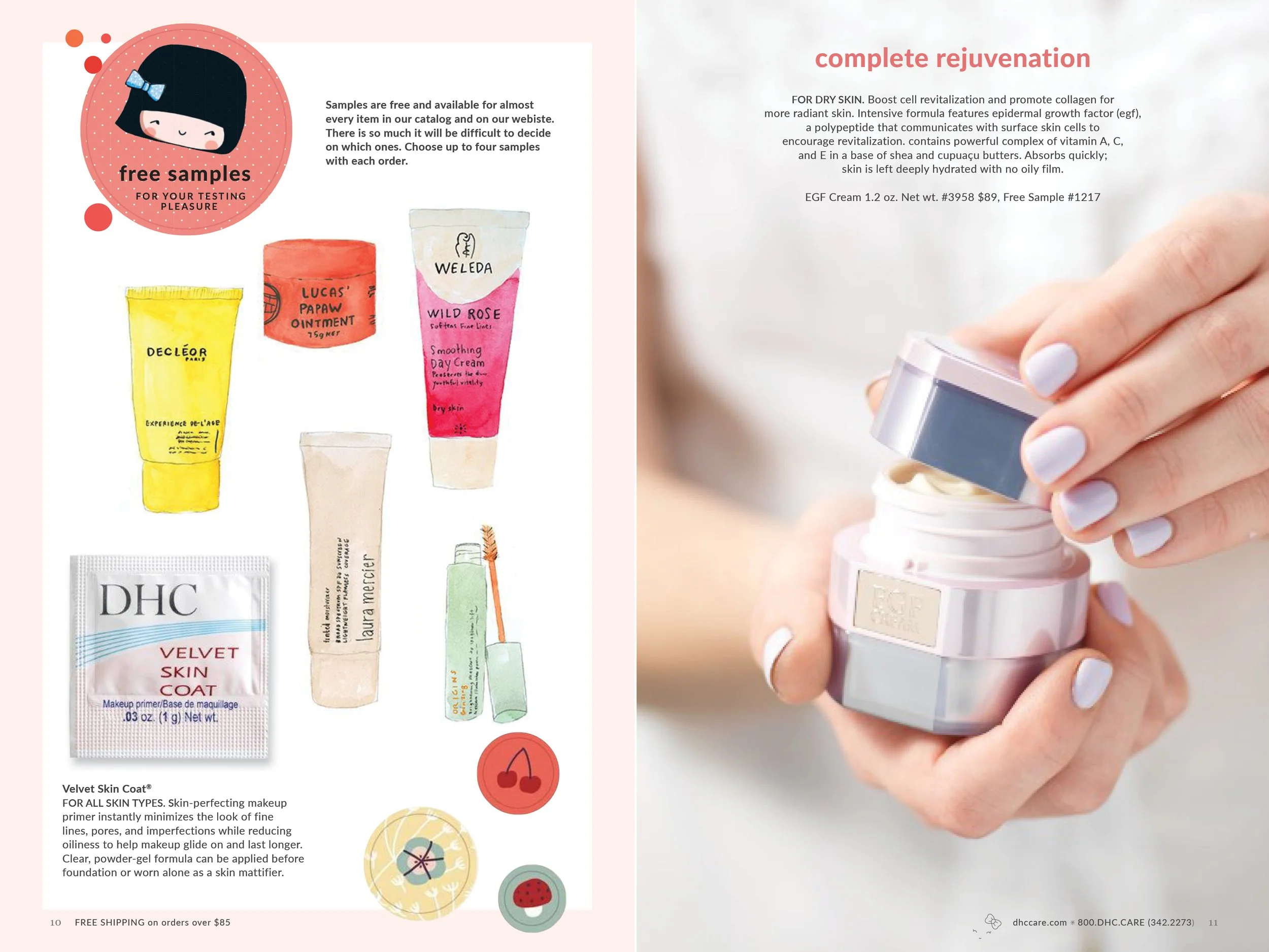
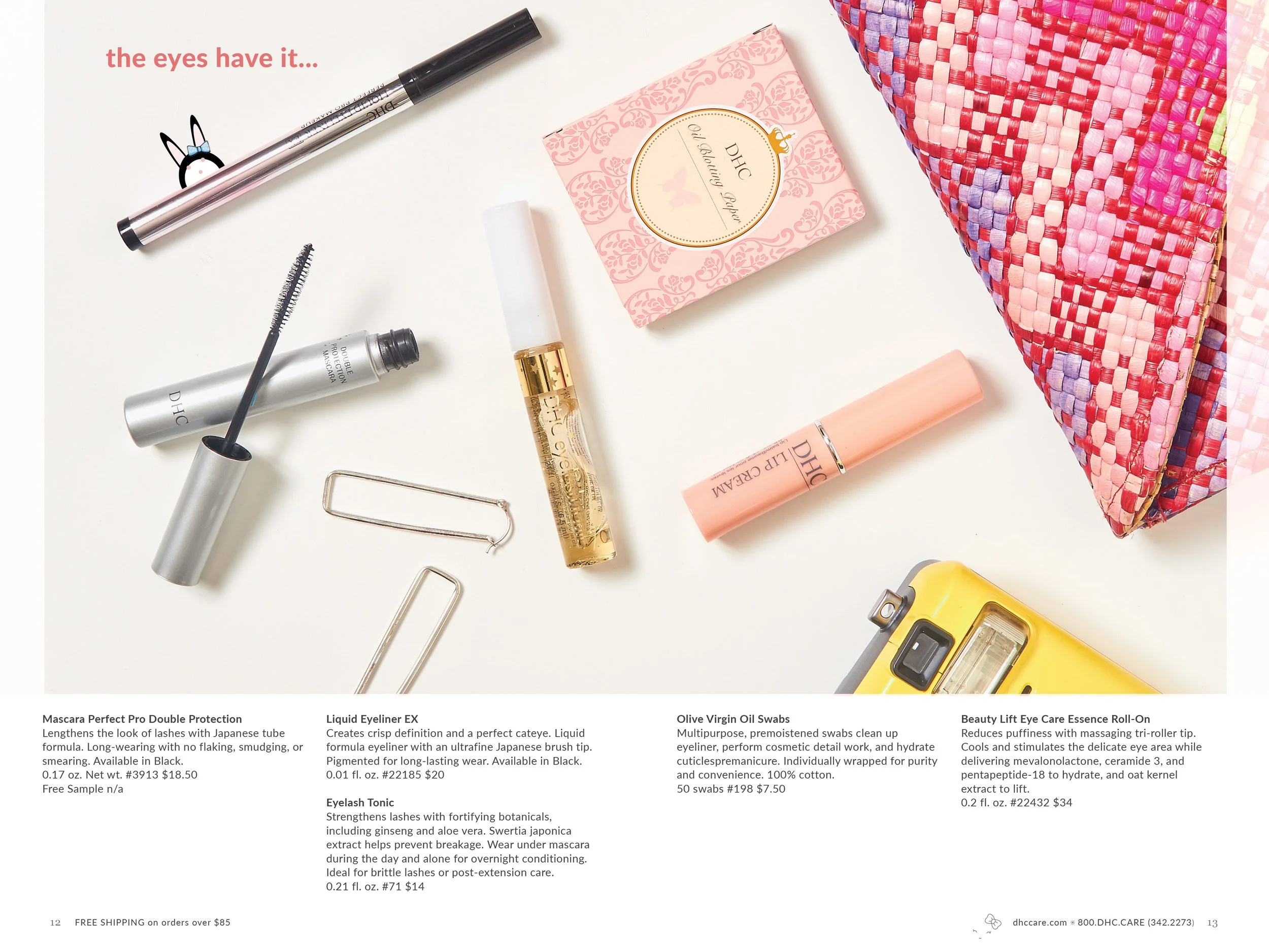
On-set Photo Art Direction


On-set Photo Art Direction

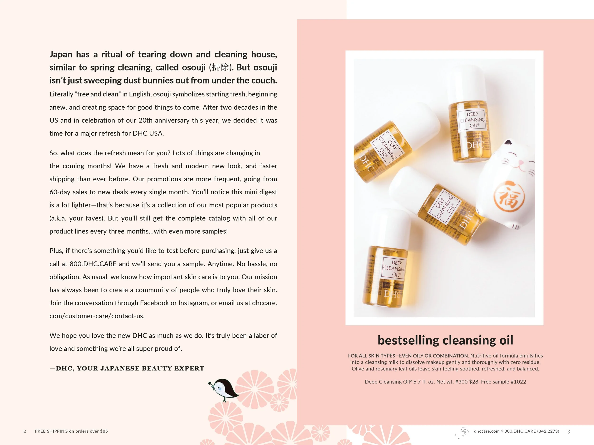
Catalog Design & Print Production

On-set Photo Art Direction

On-set Photo Art Direction

Catalog Design & Print Production

Display Advertising

Email Template Design